
Text to image tools have moved past the simple question of whether a model can make an attractive picture. The practical question in 2026 is whether it can hold a layout together: preserve hierarchy, keep a subject in its assigned region, leave room for copy, and respond to a reference without turning the whole frame into visual noise. That shift matters because a poster, product card, interface concept, or social asset is not just an image. It is a set of constraints.
The old workflow split those constraints across several tools. A team generated a visual, rebuilt the layout in a design app, replaced broken lettering, and then resized everything for each channel. Layout-aware generation does not remove that review work. It does make the first usable composition arrive earlier, which changes the economics of exploration.
What makes text to image layout-aware?
Layout awareness means the model treats position and grouping as part of the prompt, not as a happy accident. A useful result respects negative space, reading order, a focal region, and the relationship between text-sized areas and imagery. It may expose controls for aspect ratio, pixel dimensions, reference images, output format, or editable follow-up prompts. Those controls are not cosmetic. They turn a one-shot image request into a constrained rendering job.
This remains hard. The AAAI-26 paper TextGround4M describes a dataset of more than 4 million prompt-image pairs with span-level text and bounding-box annotations. Its authors call out two stubborn failures: prompt-specified text and spatial layout, especially when a design contains several text spans. The paper also proposes layout-aware metrics because image preference alone does not tell a team whether a title landed in the right place.
That distinction matters in production. A beautiful image that puts a price over a face, clips a safe area, or swaps the visual priority of two offers is not a finished marketing asset. It is a comp. Layout-aware models aim to make comps less disposable.
Why the technical shift is real
Most modern text-to-image systems start with noisy latent representations and iteratively denoise them under text conditioning. The architecture alone does not guarantee compositional control. The model needs training examples that connect a phrase or object to a region, plus a way to carry spatial signals through generation. Diffusion Transformers have helped scale this class of work by treating image patches as tokens, while conditioning and attention link those tokens to a prompt.
Research has been moving toward explicit grounding rather than hoping that larger models infer every relationship. TextGround4M adds span-level boxes to its prompt-image pairs, then uses layout-aware span tokens during training without changing the inference architecture. That is a useful engineering detail: better layout behavior can come from data and supervision, not only from a larger serving stack.
The same pattern appears in document AI. PILOT, a 155-million-parameter layout-aware OCR Transformer, emits text and quantized absolute-coordinate tokens in one sequence. It works on a 10-pixel grid and supports page transcription, region reading, and query-by-string spotting. It is not a poster generator, but it shows why coordinates are valuable tokens: downstream software can ask both what appears on a page and where it appears.
For image teams, the lesson is simple. Prompt wording still matters, but outputs become more dependable when the system has an explicit representation of location, dimensions, and reference context. The model interface is catching up with that fact.
Two layout-aware model tests
Seedream V5 Pro Uncensored: flexible image constraints
Seedream V5 Pro Uncensored accepts up to 10 reference images and offers 1K or 2K output, seven listed aspect ratios from 1:1 through 21:9, plus PNG or JPEG output. Those are concrete production controls. A 2K 3:2 asset, for example, gives a 2496 by 1664 canvas before a team makes channel-specific crops.

In the new test, the brief asked for cobalt route lines, six colored blocks, a large circular marker, margins, and no readable copy. The point was not to judge prose rendering. It was to see whether the model could maintain a visual system while leaving clean areas for editable text. That is the safer division of labor for campaign work: generate the scene and hierarchy, then set critical wording in the design file.
P Image Ideogram Custom: poster-first constraints
P Image Ideogram Custom takes exact width and height values up to 2560 pixels, a reasoning setting, prompt upsampling, and JPG, PNG, or WebP output. Exact dimensions reduce a common source of waste. A team can request 1920 by 1280 for a landscape concept instead of generating a square image and discovering that the crop destroys the composition.

The second test used a black modular grid, one oversized orange circle, four image blocks, and a ban on words, numbers, logos, and labels. It produced a clear hierarchy without asking the model to solve brand typography at the same time. This is a better stress test than a generic cinematic prompt. It asks whether the generator can follow placement rules that a designer can build on.
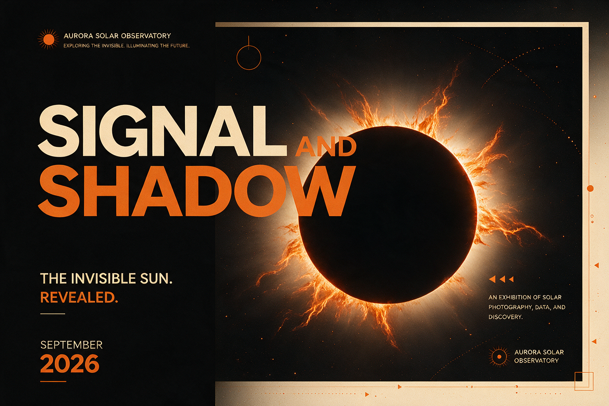
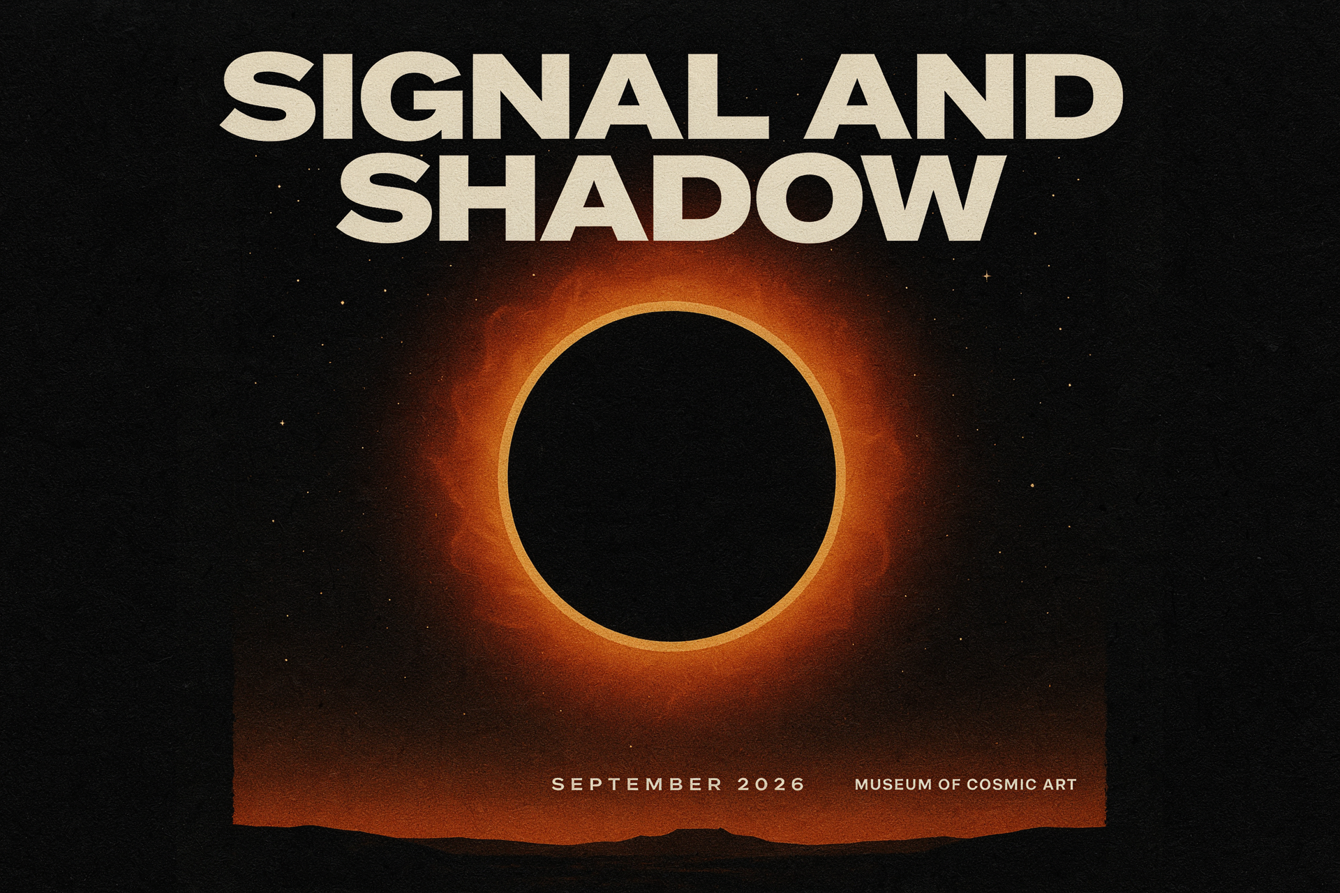
The existing poster tests below remain useful for the opposite case: where the generated design must carry a headline and date. They show why text rendering deserves its own validation pass.
Why developers and infrastructure teams should care
Layout-aware generation adds product value, but it also adds operational requirements. Resolution, aspect ratio, reference count, and reasoning settings all influence latency, queue behavior, storage volume, and retry cost. The interface should record them as first-class request fields. A prompt string on its own is not enough to reproduce an asset.
Teams should persist the model version, prompt, seed when available, dimensions, reference asset hashes, output URL, moderation state, and acceptance decision. That metadata makes it possible to compare a 1K exploration run with a 2K approval candidate, investigate a regression, and estimate the GPU or API budget behind a creative workflow.
Evaluation needs more than CLIP-style similarity or a thumbs-up score. Track text accuracy, object-region adherence, safe-area compliance, crop survival, and edit time after generation. The TextGround4M work is a useful signal here: it separates text fidelity, spatial accuracy, and prompt consistency instead of compressing everything into one aesthetic judgment.
Serving systems also need predictable fallbacks. If a result has wrong copy, route it to a text-free visual variant and add final type in Figma, HTML, or a template renderer. If reference conditioning fails, retry with fewer inputs or a clearer composition brief. Do not silently ship the first image because it looked convincing at thumbnail size.
A practical workflow for layout-aware generation
- Write the layout brief before the style brief: canvas, focal area, negative space, reading order, and crop targets.
- Generate text-free visual compositions when legal copy, prices, dates, or product claims must be exact.
- Use fixed dimensions for channel-specific deliverables and save those values with the run.
- Review at delivered size, not only in the generation preview. Small type and edge spacing fail first.
- Keep final brand type in an editable layer, then use the generated asset as the visual base.
Text to image is becoming a more useful design-system component, not a replacement for a design system. The gain comes from producing a coherent first layout quickly, with enough control to survive review and enough metadata to reproduce it. Run these models against a real brief on Wiro, then measure the time saved after the asset enters an actual production pipeline.