Grok vs Ideogram Custom is a useful comparison because the two models solve the same job in different ways. Grok Imagine Image V2 leans toward flexible generation and quick edits, while P Image Ideogram Custom pushes harder on typography and fixed layout control. The official Wiro pages for Grok Imagine Image V2 and P Image Ideogram Custom spell that out clearly. For background on the underlying models, see xAI’s Grok Imagine Image 2.0 documentation and Ideogram’s text-rendering overview.
This test used five prompts across both models, with the same aspect ratio and the same creative brief each time. The goal was not to chase pretty samples. It was to see which model handled clean hierarchy, readable text, and compact design pressure without falling apart.
On this page:
How the Grok vs Ideogram Custom test was run
The prompts all asked for real layout work: a product hero, a club poster, a chalkboard menu, a billboard, and a small technical infographic. That mix matters. It shows where a model can keep the scene stylish and where it can still hold the text together. The focus was on readability, spacing, and how often the composition drifted away from the brief.
| Prompt | What it tested |
|---|---|
| Electric scooter hero shot | Whitespace, product framing, short headline text |
| Jazz club poster | Poster hierarchy, bold title text, color balance |
| Ramen menu board | Column layout, tiny type, handwritten texture |
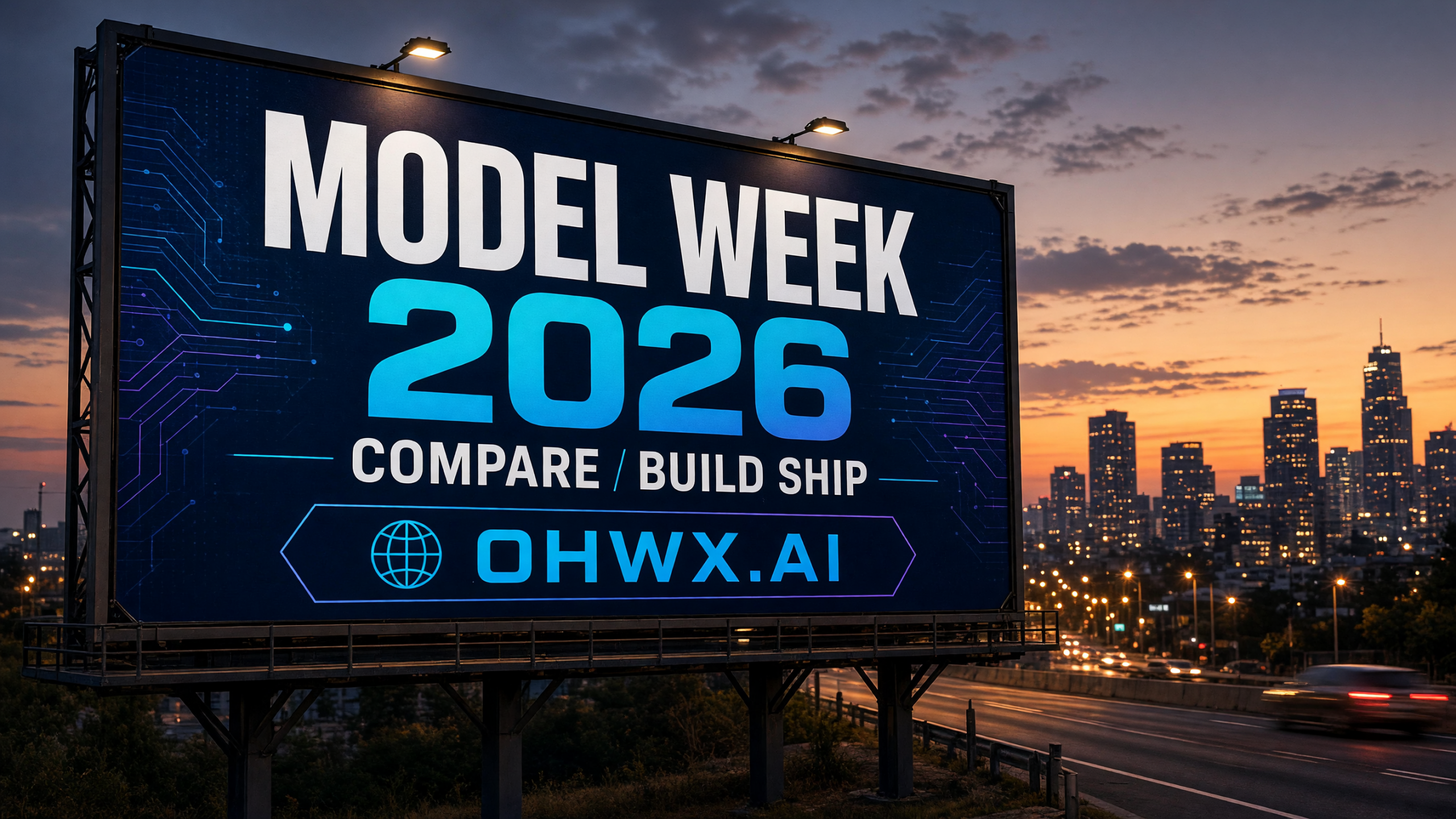
| AI conference billboard | Big readable copy, outdoor ad composition |
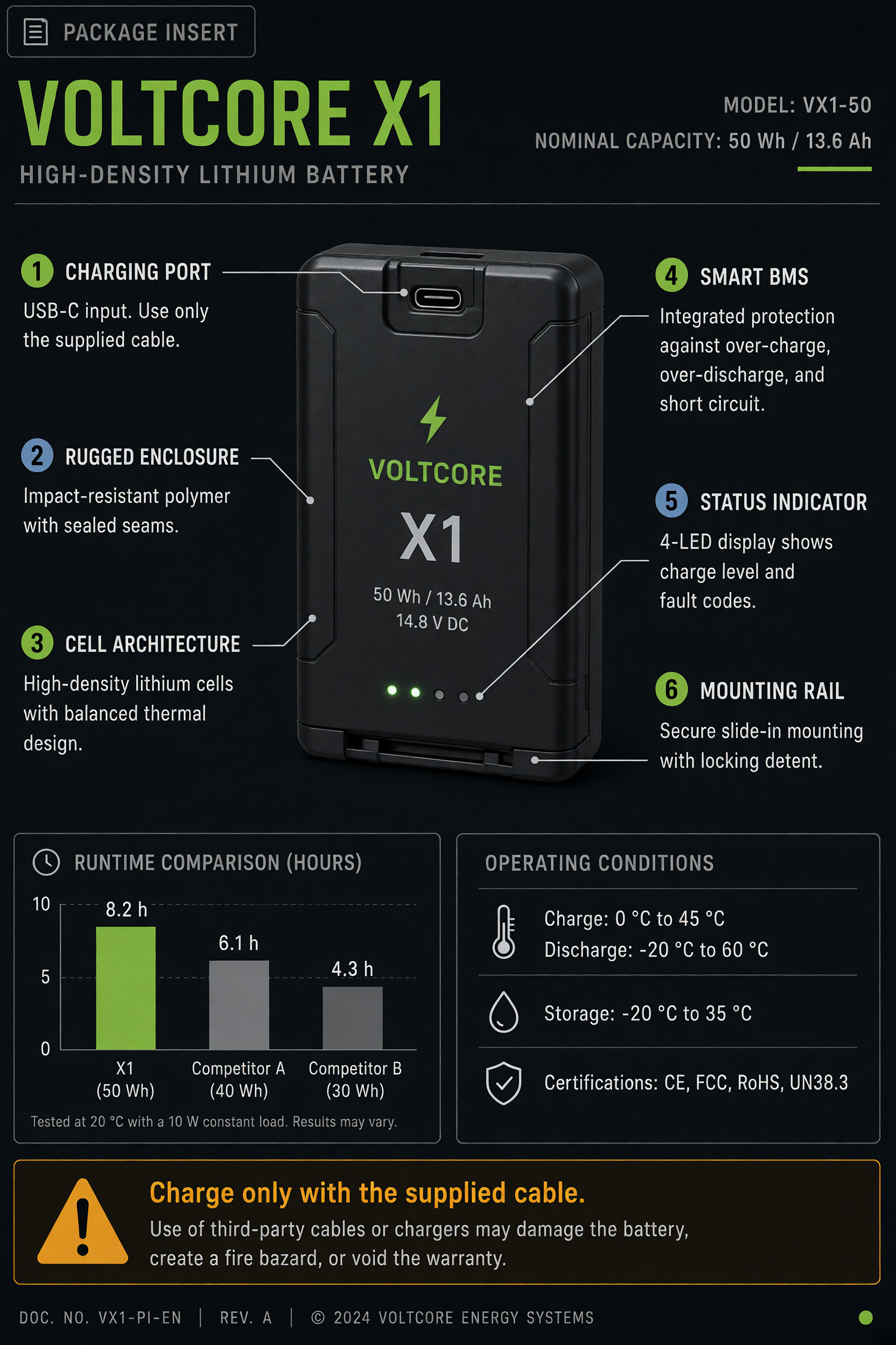
| Battery infographic | Dense labels, callouts, small technical text |
1. Hero product shot
 |
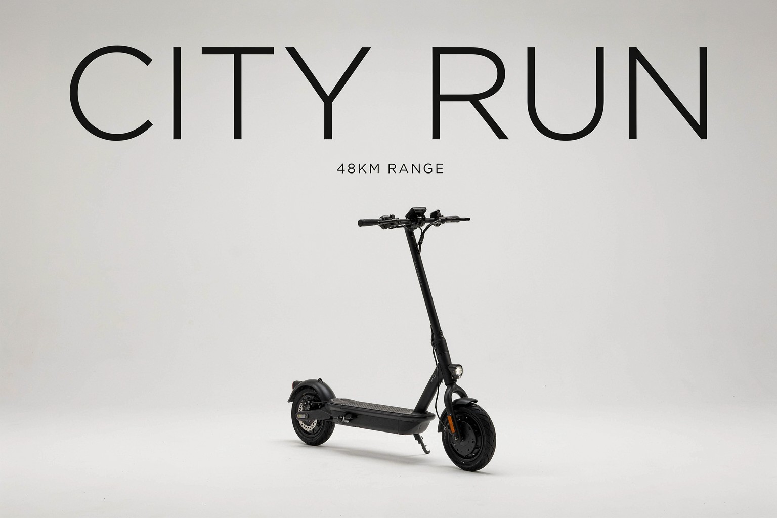 |
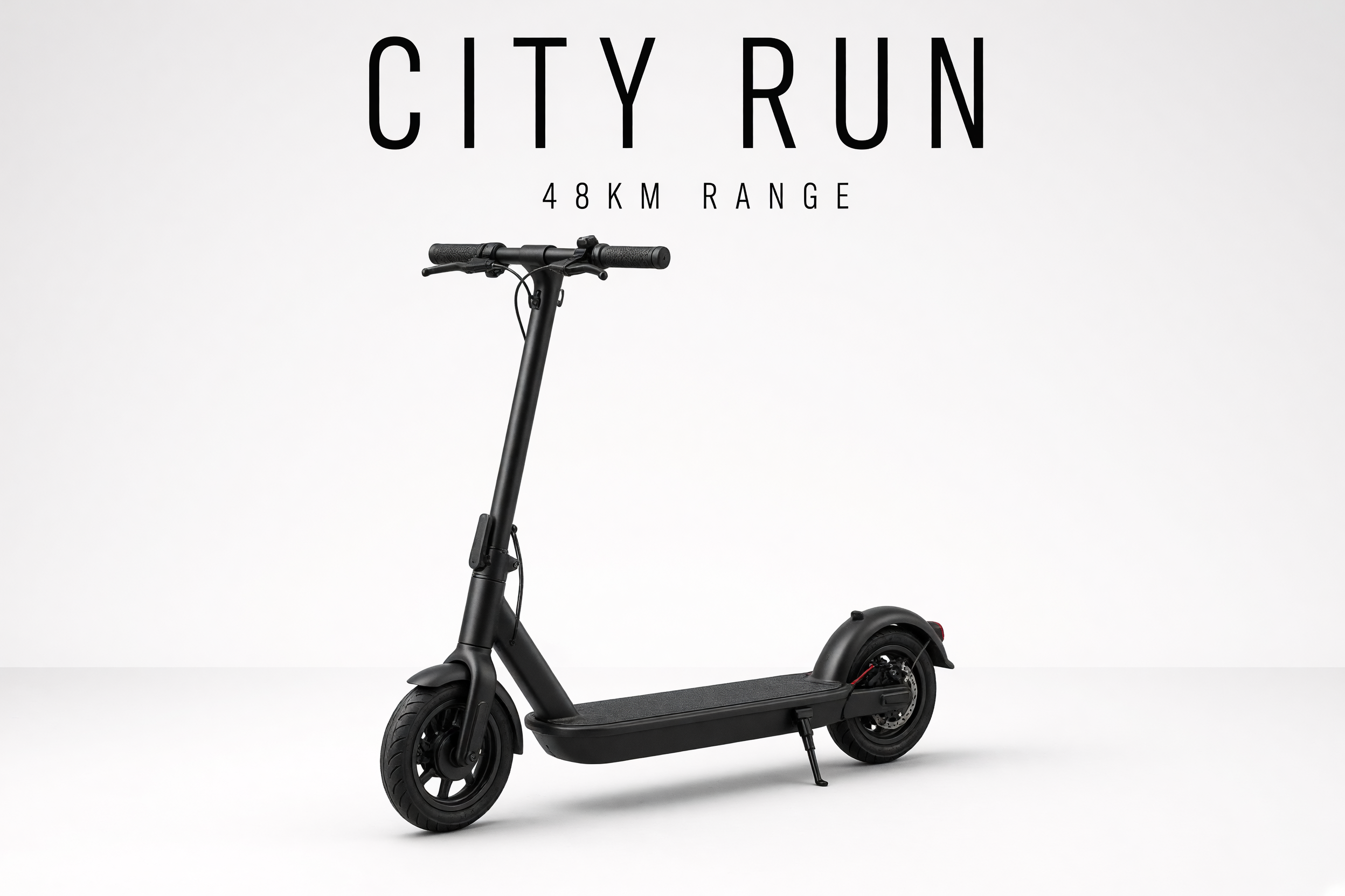
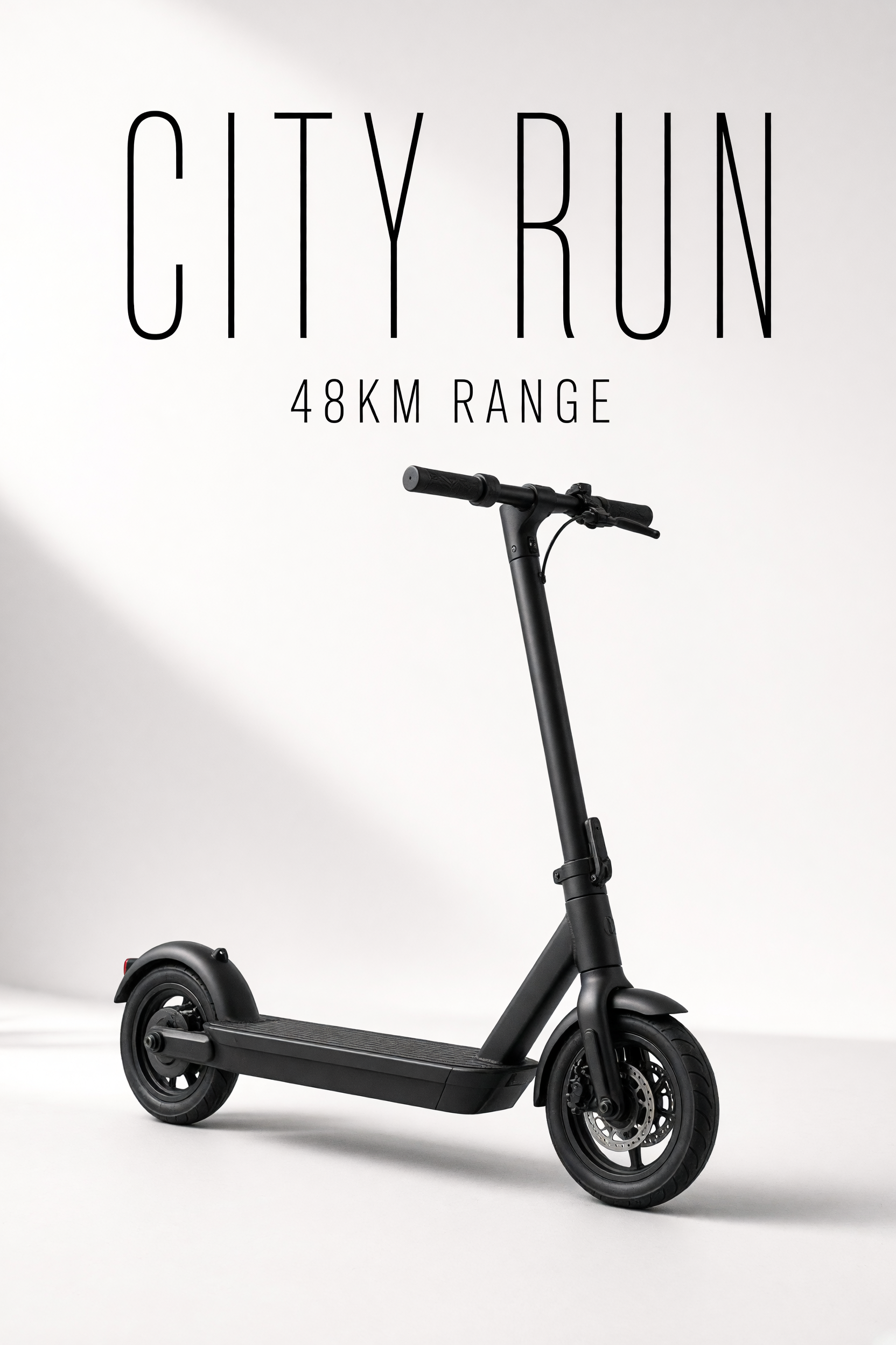
Grok kept the scooter scene cleaner and more open. The product sat naturally in the frame, and the headline felt integrated instead of pasted on. P Image Ideogram Custom still handled the short text well, but the layout leaned more graphic and a little tighter. For simple hero shots, Grok feels smoother. For locked poster-style framing, Pruna stays more deliberate.
2. Event poster
 |
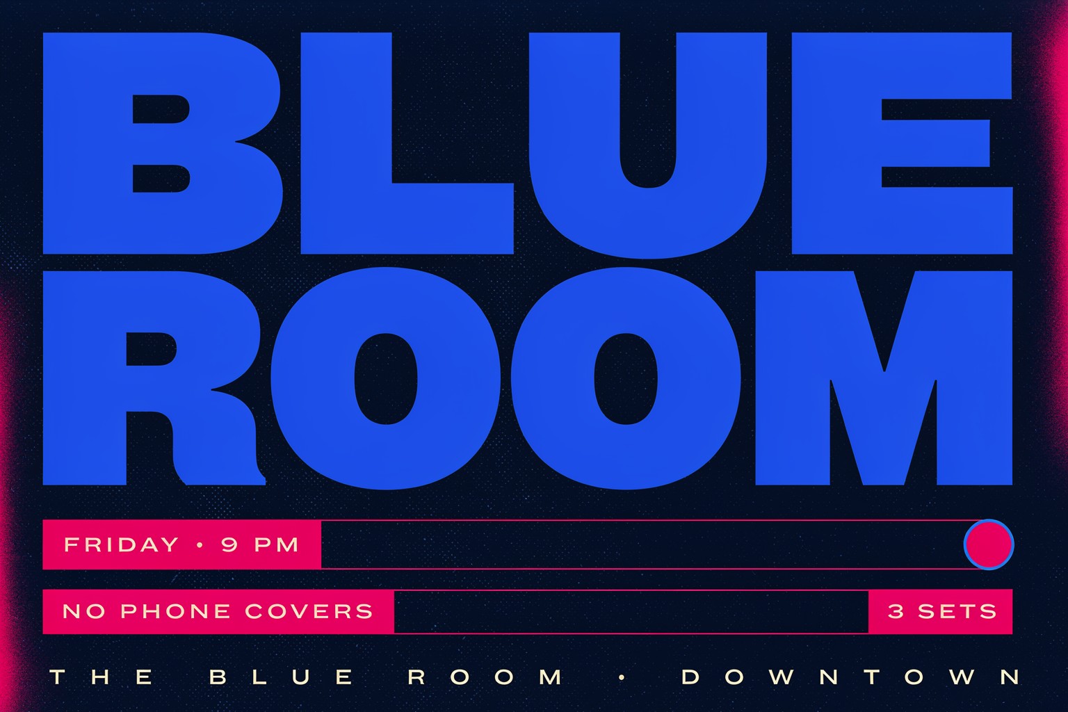 |
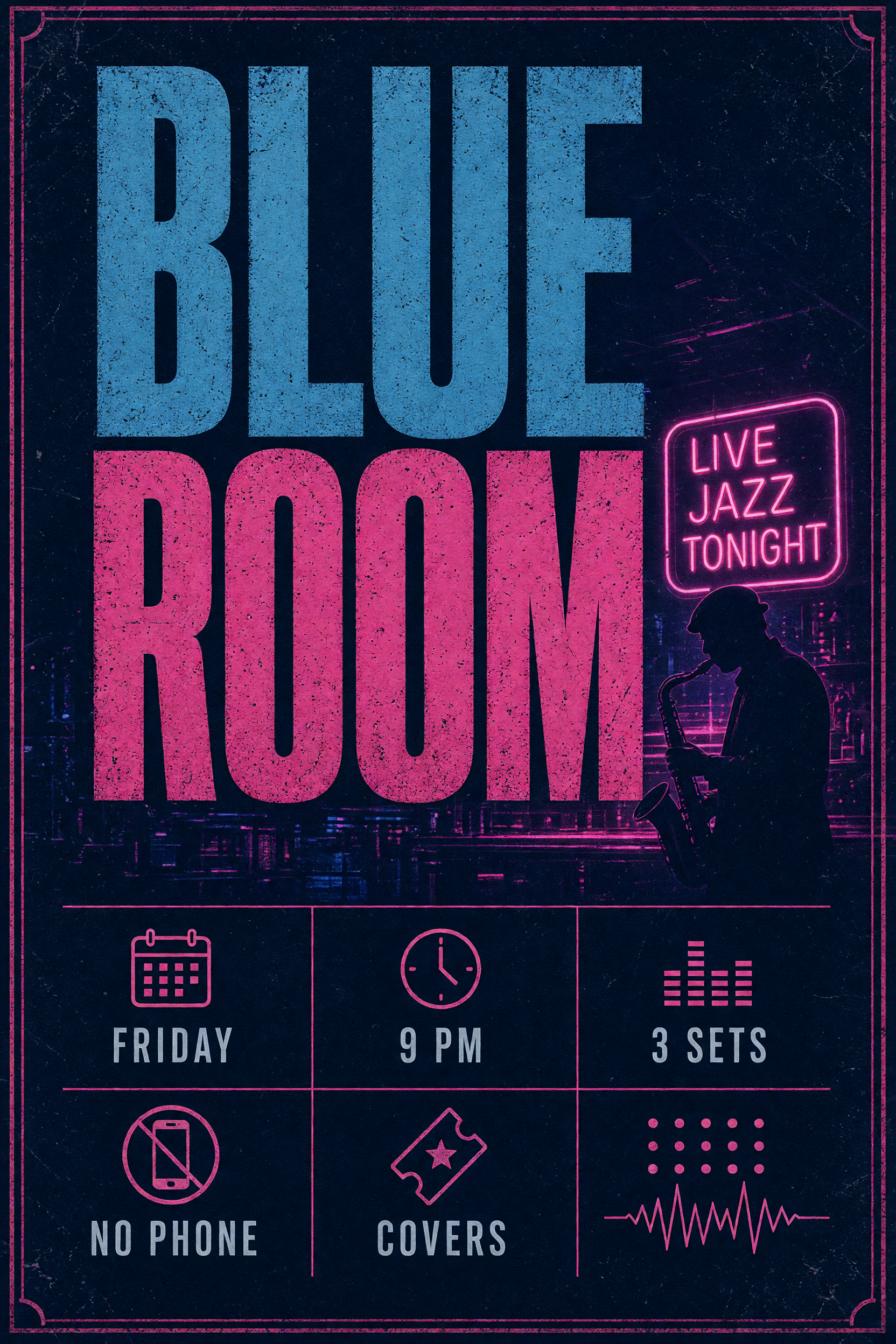
This is where P Image Ideogram Custom starts to pull ahead. The jazz prompt asked for a grid, and Pruna stayed closer to that idea. Grok still produced a usable poster, but the composition felt looser around the edges. If the job is an ad-style graphic with a strong title block, Pruna gives more predictable results.
3. Menu board
 |
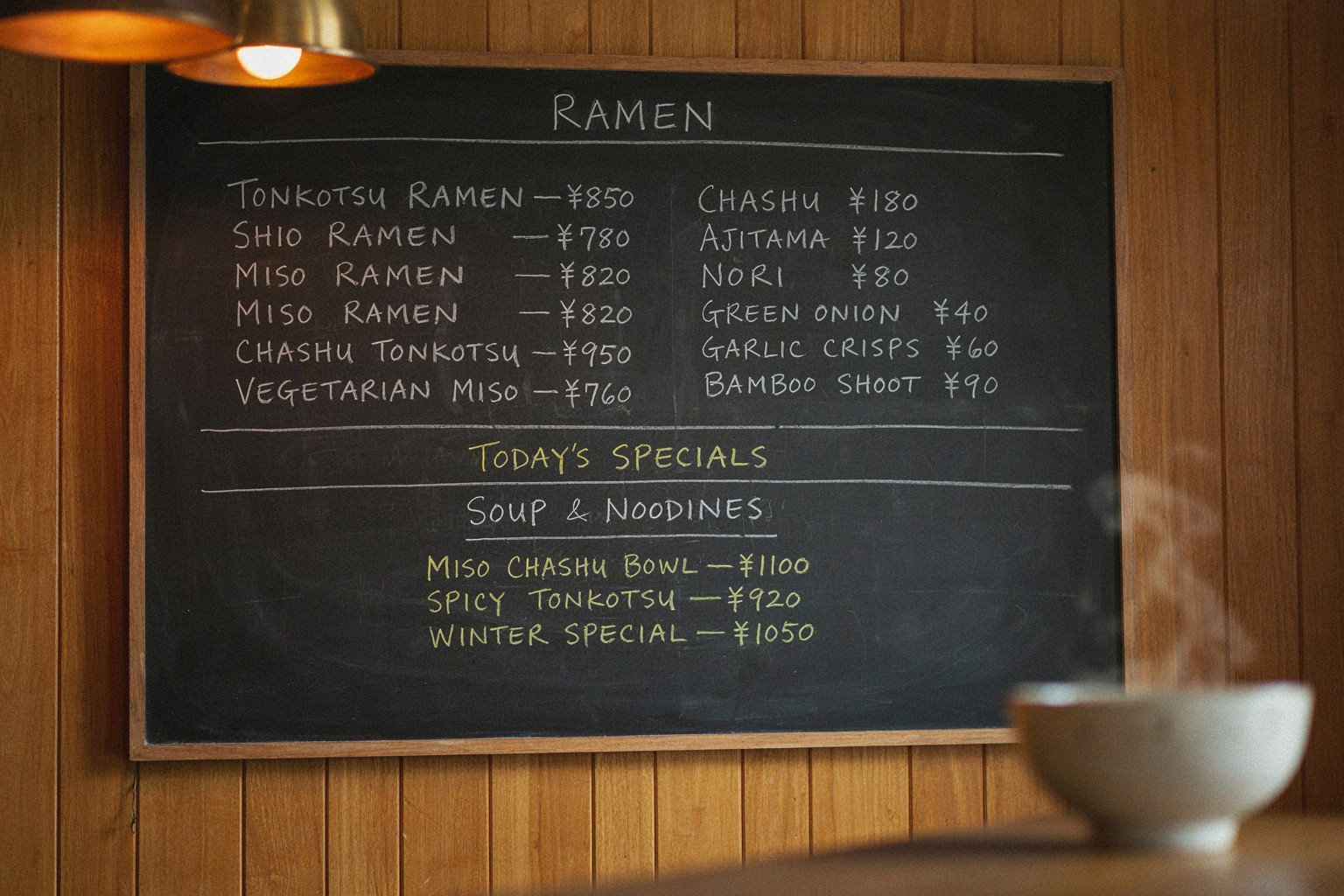 |
The menu prompt exposed the gap between “nice image” and “usable layout.” Grok created a warmer food scene, but the text structure drifted more. Pruna kept the menu more organized and closer to the column layout. The handwriting still looked synthetic, but the menu was easier to read. That matters more than polish here.
4. Billboard copy
 |
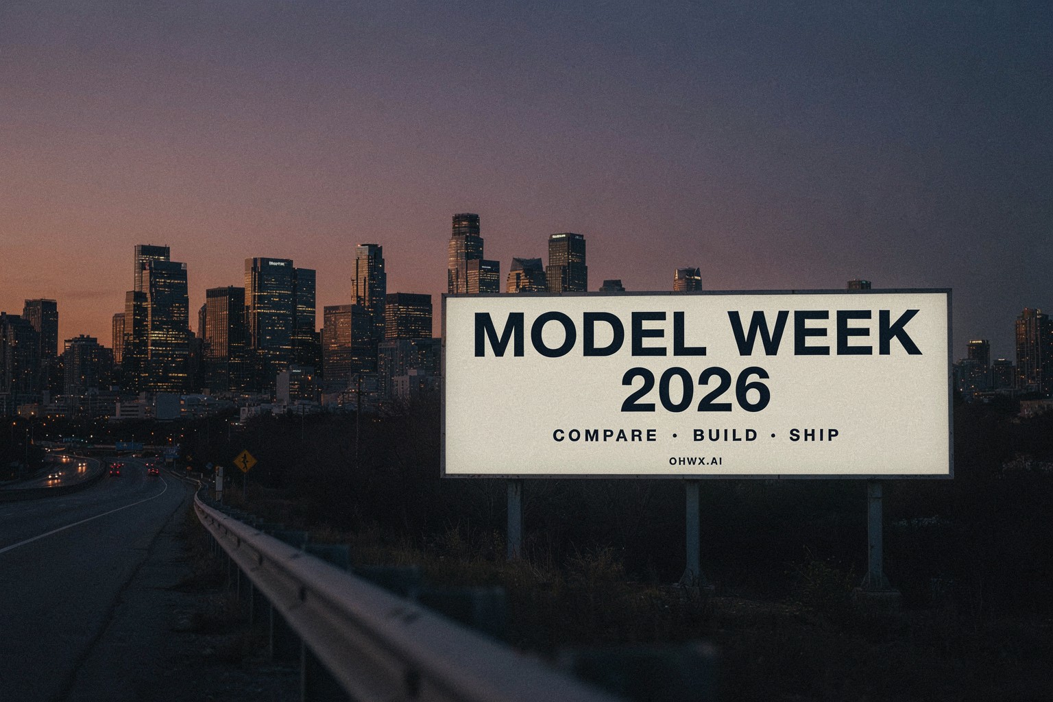 |
The billboard pair is the closest call. Grok delivered stronger atmosphere and a more cinematic sky. Pruna delivered the cleaner text block. The billboard is a good example of how these models split the work: Grok handles mood, Pruna handles structure. For marketing copy that has to read fast from a distance, Pruna is the safer pick.
5. Compact infographic
 |
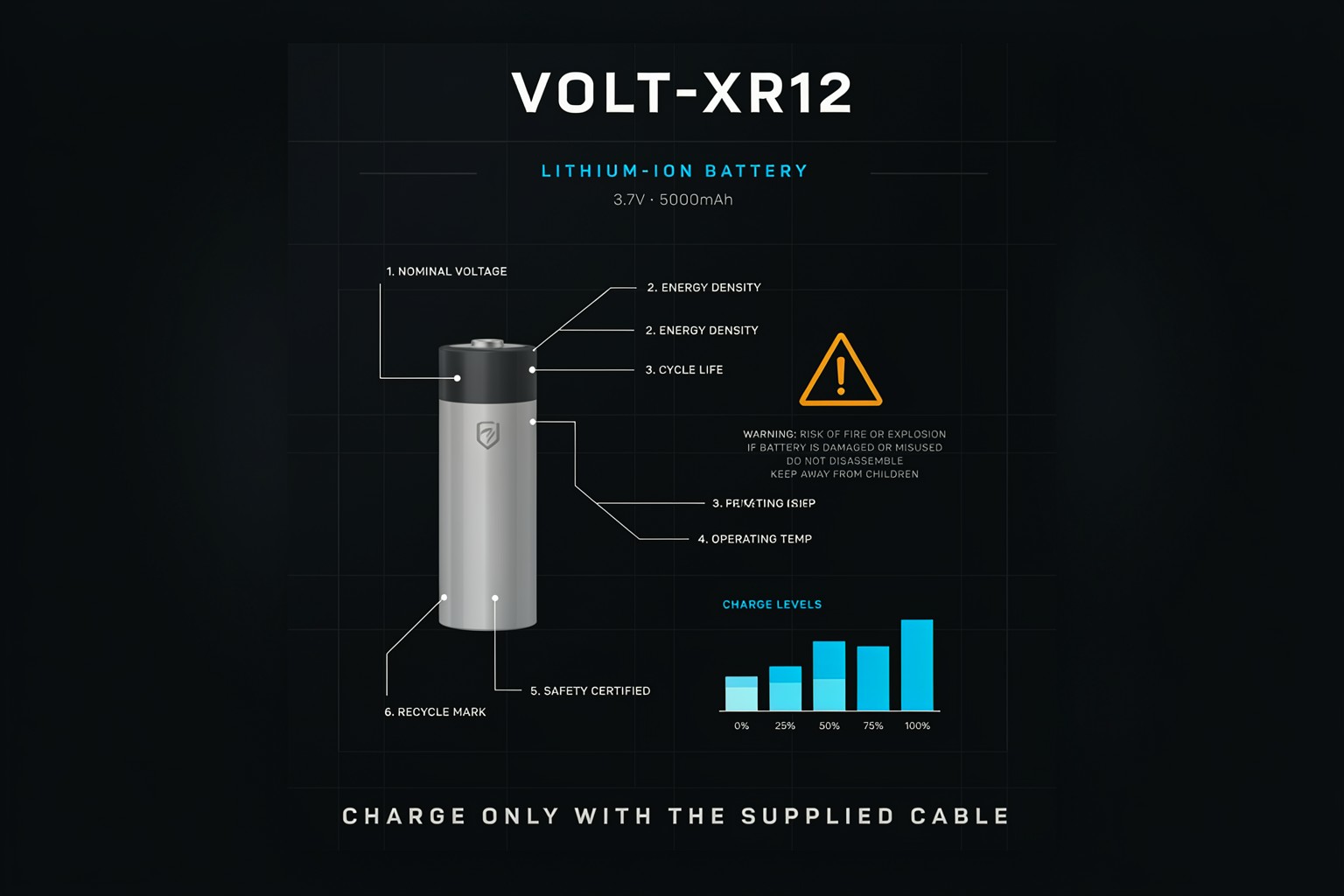 |
This was the hardest prompt. Grok made a strong-looking graphic, but the smallest labels started to blur together. Pruna kept the information block more organized and closer to the requested structure. For technical graphics, manuals, and dense product inserts, Pruna was the better fit by a clear margin.
Verdict
| Use case | Better pick | Why |
|---|---|---|
| Hero product shot | Grok | Cleaner spacing and a softer editorial feel |
| Poster and ad layouts | P Image Ideogram Custom | Stronger hierarchy and steadier text blocks |
| Menu boards and signs | P Image Ideogram Custom | More reliable text placement |
| Billboards | P Image Ideogram Custom | Better distance readability |
| Dense infographics | P Image Ideogram Custom | Clearer structure under pressure |
Grok vs Ideogram Custom is really a mood-versus-layout tradeoff. Grok feels looser and more cinematic. P Image Ideogram Custom feels stricter and more graphic. If the job needs atmosphere, Grok wins. If the job needs readable design, Pruna wins. Run both on Wiro and compare them on the same prompts: wiro.ai.